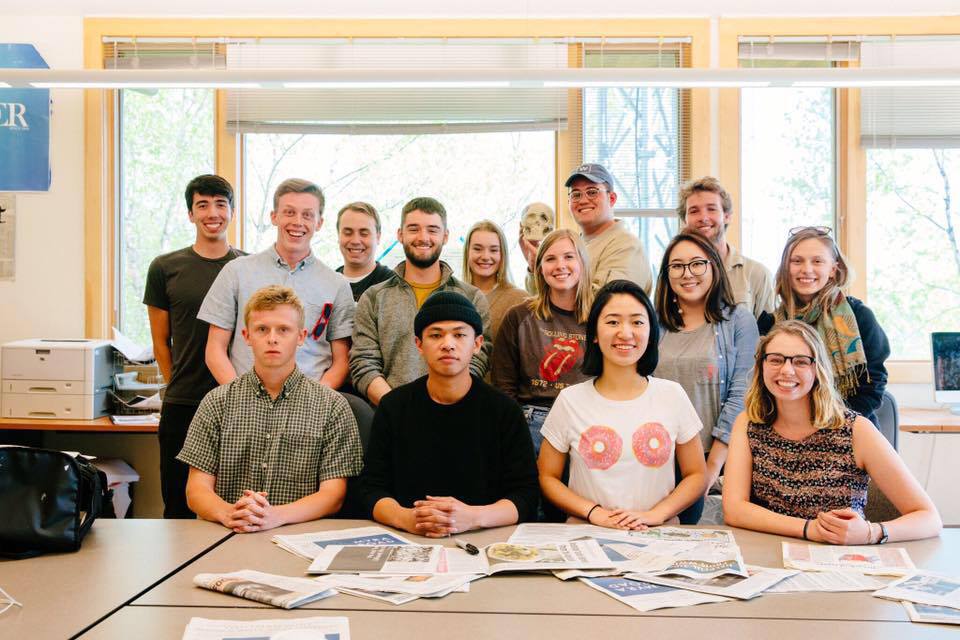
Hi! Welcome to the first in a series of blog entries about the making of the print edition of the Whitman Pioneer. My name is Ted Hendershot, and I’m responsible for the design of the print edition and its weekly layout. I’m proud to announce the new production staff. Beginning with the coming issue, no. 2, these will be the talented designers bringing you the eight weekly pages that make up the Pioneer, as well as our magazine companion, the Circuit:
Front Page & Feature: Ted Hendershot
News: Sean McNulty
A&E: Madison Munn
Sports: Molly Olmsted
Opinion: Allison Work
Backpage: Cara Patten
Infographics & Feature Graphics: Katherine Berfield
In this first blog, I’d like to talk vision, as well as discuss the design process for the first issue’s front page and the redesign of the previous semester. In subsequent weeks, I’ll be talking about front pages, infographics, production night hijinks, and the little details that make the Pio look like…well, the Pio.
New Feature: Lift-Outs and Pull Quotes
This semester continues the phased redesign of the Pio that began at the beginning of last semester. This first issue unveils a new style for pull quotes and lift-outs, those boxes which tease a quote lifted from the article. These pull quotes break a fundamental rule of design: promote contrast. Specifically, the leading quotation mark slightly sets off the left edge of the element. It’s arguably not optimal, but I think it’s our best pull quote style to date. I love the lift-out style–it’s astonishingly clean, and almost automatic for our designers, as it makes use of InDesign’s “paragraph rule” feature.
Flag Logo
The redesign I started work on last year was intended to create something fairly permanent–a Pioneer brand which was simple and elegant enough to remain around for a while, even as different Production Managers apply their different tastes to individual elements. The cornerstone of the redesign is Maggie Appleton’s elegant, classic typographical “The Pioneer” logo. “The” is set in CAC Champagne, a modern script font apparently designed by the American Greetings Corporation. I’d love to redraw this face to make the trailing stroke of the aitch into the initial stroke of the e–perhaps later in the semester. The font appears to have been abandoned–I might seek out a similar font to replace it with. “Pioneer” is set in hand-kerned Baskerville Old Face, a classic digital face based on the legendary John Baskerville’s original glyphs, completed in 1757. Despite the name, Baskerville is a Transitional, rather than Old Style typeface, being closer to the familiar Bodoni and Walbaum moderns than, say, Caslon, the greatest of the old serifs. (You’ve seen William Caslon’s eponymous typeface everywhere. The Declaration of Independence was set in it, and many of the greatest English-language authors swore by it. George Bernard Shaw was proud to call himself “a Caslon man,” and the typesetter’s motto in the period was “When in doubt, set it in Caslon.”) Benjamin Franklin preferred Baskerville for its clarity and the perfection of its glyphs, a quality often ignored today, as modern uses of faithful Baskerville reproductions often fake-age the letter forms to create an eighteenth-century “look.” The Canadian government is largely typeset in Baskerville, and the famous “Canada” wordmark with the maple leaf flag over the final “a” is in that font. If it’s good enough for Canada and Ben Franklin, it’s good enough for us.

I made two sneaky changes to the logo–the first, shifting the positioning of the “The,” and the second, removing the strokes (or “lines”) connecting the upper and lower serifs (or “sticky-out bits”) on the glyphs (or “letters”) of “PIONEER.” This makes the logo a bit simpler–just two text boxes in InDesign, rather than a complex Photoshop file with strokes, shading, and color information. The other big change was stealing that shading away and representing the logo as black-on-white–more on the different flag in another blog.
Font Guide
While I hope our logo survives me and several generations of PMs, fonts will inevitably change. Our current faces are a modern Times New Roman-derivative called “Tinos,” used for body copy, and a Russian family called PT, which we use in its Serif and Sans-Serif styles for headlines, infographics, and most other design elements. For the first issue, we introduced two new one-off fonts: the much-loved Gotham (page 2 News and Feature), well known as the official Obama campaign font, and Hoefler & Frere-Jones’ font Knockout (front page infographic), widely used by the New York Times Magazine for infographics. I selected the latter for the eating disorder infographic based on its similarity in heft to Helvetica, the standard font for Nutrition Facts boxes in the U.S.
Deciding on the fonts for the first issue last semester was the work of several days. They’ve remained for fifteen issues, and I feel confident that they’ll stay around for a while. You may see more fonts pop up later in the semester as we branch out and flex our design muscles.
Infographic
Finally, I designed a photo-infographic for this issue–a comparison of a normal and anorectic meal for the front page article on eating disorders. The food was prepared in consultation with article author Rachel Alexander, resulting in calorie counts which are as accurate as we can surmise. The objective for the photos was to create shots which were appropriately glossy, yet not overly dressed or styled–to give the impression of real meals, but not ugly meals. I painted the garlic bread, strawberries, salads, and tomatoes with egg white, to give a natural gloss, while the pasta required extra oil to create highlights on camera. Without a professional lighting rig, eliminating shadows and balancing color was incredibly challenging. (Without even a reliable speedlite, we had to use incandescent lights and a ring flash.) The result was pleasant once printed, although the imperfect color registration gave the photos a blurry appearance on the page.
Thanks for reading! Next week, we’ll have new graphics to go over, along with photos of the always-surreal production night experience.
Cheers,
Ted


