A New Era for the Blues: Whitman Reacts to New Logo
October 4, 2017

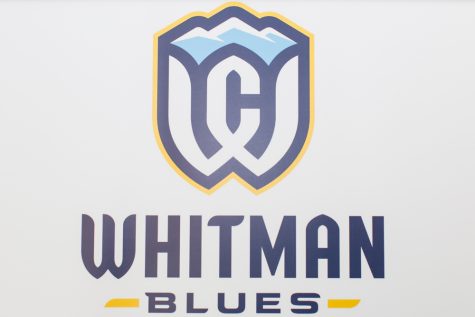
The changing of Whitman’s mascot from the politically charged Missionary to the Blues meant that the old–and one might say elegant—athletics logo was in need of a facelift. Whitman’s one-time emblem that appeared as if the capitalized ‘W’ was linked arm-in-arm with its fellow consonant has now become an anachronism that does not quite do justice to the majestic Blue Mountains that have been incorporated into the College’s brand. This decision came as a fitting change for some, and was treated with utter neutrality by others. But, whether you love the new logo, hate it or did not know the College had an athletics logo: there can be no question that it was created by one of the best in the business. I do mean that, the best.

One of the premier names in the designing of logos is Joe Bosack and Co. This small design outfit operating out of Pottsville, Pennsylvania was responsible for the creation of the 2016 Final Four logo, and that is exactly whom the college brought in to take on the project of incorporating the newly anointed mascot into a universal brand.
“What we want to do is show a unified Whitman athletic program that is a part of the college. So, the logo is not just about athletics, it is our athletics logo, but it needs to fit into the whole college,” Whitman Athletic Director Dean Snider said.
Snider also detailed the process that Bosack and Co. undertook when they arrived on campus. The niche design firm interviewed coaches from every team, president Murray, support staff, SAAC and anyone else they could get their hands on in an attempt to create a look that reflected answers to the question: what does Whitman College represent to you? After synthesizing hundreds of answers to this all-important question, the design team pursued an image that represented a feeling as much as it did an expressible idea, and a new sigil was born.
Contrary to popular belief, however, there is not a homogeneous celebration by athletes for the College’s new image. Speaking with tennis player Hanna Greenberg, a senior and member of the doubles championship team that took the ITA/Oracle Northwest doubles tournament by storm last weekend, she expressed nostalgia over the loss of the retired logo.

“Personally, I preferred the old logo,” Greenberg wrote. “The old WC was simple, easily recognizable and looked great on apparel. Therefore, I’m not as excited as others on the switch to the new logo.”
While Greenberg lamented the aesthetic loss, Men’s basketball junior, and do-it-all guard, Joey Hewitt, connected the logo to the larger Whitman community.
“I believe a logo should represent something more than just the school’s name, and Whitman did a nice job with this by incorporating the mountain range to intertwine our logo and our mascot into one,” Hewitt explained. “I believe the goal is to unify the students to support their college, and by using the mascot in the new logo, it gives students a semantic relationship to the logo, rather than if it was just the letters ‘WC’.”
While there might be dissent over which logo looks better, or what an incorporation of the Blues into the logo does for the Whitman community, Snider certainly explained the rationale for the new logo in a clear and concise manner.
“The whole idea to come together is to build a unity and build an identity that we can all get behind and feel proud of.”
The new logo appears to make an attempt toward such a goal.


Ed • Oct 6, 2017 at 5:22 pm
Not a fan of the new logo……..They could have perhaps retained the old letters and incorporated the mountains in somehow….do a better job like the Pac-12 did with their mountains….the font is lousy and the W is particularly ugly. I’m going to treasure my t-shirts with the logo of old….